What’s A Whatchamacallit?
A Group Exhibition at Gallery CA Explores America’s Uneasy Melting Pot
“A whatchamacallit is a phrase used to name something we do not know and whose characteristics are predetermined by a group of individuals who want to acknowledge it.” – James Williams II
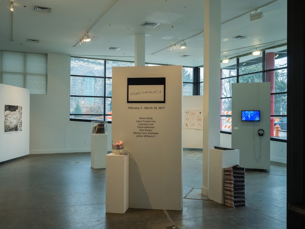
Whatchamcallit, the group exhibition and publication installed at Gallery CA includes contributions from Diane Kuthy, Joyce Yu-Jean Lee, Lawrence Lee, Olivia Robinson, Paul Rucker, Mandy Cano Villalobos, and James Williams II, the show’s curator. Williams declares Whatchamacallit, “a riposte to the superimposed cultural identities and labels that we individually find ourselves participating in, given to us by others. The artists in Whatchamacallit who are “obsessed over [their] identity” share an interest in challenging the cultural and social identities on both a micro and macro level.”
At the exhibitions opening, visitors were invited to fill out and wear their name or preferred identifier on a name tag. The question posed by the name tag “Hello My Name Is____”, is a central query of the exhibition.

The Whatchamacallit publication, a printed newspaper-esque collection of interviews and thoughts from the artists, attempts to contextualize the huge questions the show interrogates, mainly what is identity and how is it ascribed.
With such a vibrant title I briefly presumed the works would be satirical, bright, texturally complex, colorfully robust in their dissection of identity. What I found was more true to America’s flattened categorizations, more reflective of the binary identification that many comfortably assume and designate to others; a polarized palette, black and white/beige, red and blue. The colors embodied heavy symbolic inferences; the flag, the concept of whiteness, stereotyped blackness, mirrors, books, and flat LCD’s projecting our skewed assumptions and national worldviews back at us.

Lawrence Lee’s work, “Son of a Machine Gun II,” 2016, is strange and beautiful; a fantastical drawing of a jungle landscape peeks into a world where inky black characters war with each other and animals in an epic battle ring. A young girl and alligator observe the carnage from the sidelines. The leaves of surrounding plants resemble hands that wave and stretch out towards the arena. The right panel of the work is designed in the style of early combat RPG’s like Mortal Kombat, Tekken, Street Fighter, that allow you to choose your own character.
“Machine Gun’s” characters are racial stereotypes; unnaturally black, with exaggerated lips, bulging eyes, teeth baring caricatures—in essence, the ever lurking pickaninny-boogie man. This all too familiar distorted image has been used to substantiate and solidify an ideal of black masculinity that is violent, inherently brutal and beastly. This scripted identification is often employed in the imagery of popular culture and the rhetoric of conservative politicians to reinforce cultural fears and substantiate legislations which closely monitor and patrol the ‘other.’ Stop and Frisk, Muslim immigration bans, the killing of unarmed black men, are devastating contemporary examples of the dangerous implications this imaginary threat encourages.
During a brief interview with some of the artists, Lee, a tall, muscular African-American male and full-time fire fighter, shared his observations of people’s reactions to his size and complexion. “Being a fire fighter, I wear the uniform and become ‘safe.’ I wear fire fighter shirts even when I’m off duty because otherwise I feel like I’m a monster, so I draw those monsters on the page.”
That Lee’s body and race are seen as potentially menacing has forced him to adopt a uniform that would mark him as “safe;” it is no wonder that the trauma of those daily micro-aggressions and unwarranted projections catalyzed Lee’s inward exploration and his creation of mythic warring worlds. The characters and landscapes Lee draws reflect the rage and frustration he cannot express in real life.

Diane Kuthy and Olivia Robinson’s contribution, “Swaddled,” is inspired by illustrations popularized by the ‘This Is America’ campaign posters of the 1930s and 1940s. Kuthy and Robison sew a new chapter into the fabric of American history that reimagines the country devoid of any color, cultural, or racial variance—a literal fluffy white world. The landscape, architecture, and agriculture are stitched outlines on a milky white quilt. Only the faces, arms and hands of the house wives, the children, the old praying women, the laborers, and everyday citizenry are beige and smiling, their bodies are similarly vague outlines that mirror the world in which they inhabit; a constructed reality within the banal white of the quilt.
Kuthy and Robinson determined that the intent of the ‘This Is America’ posters were inherently divisive, “the posters explicitly contrast American freedom with the ‘enemy’ abroad and implicitly are juxtaposed with an ‘enemy’ within.” It is important to note that the posters were distributed nationwide while President Franklin D. Roosevelt signed Executive Order 9066, which forced thousands of Japanese American citizens into internment camps. The intent of the ‘This is America’ campaign was to invigorate the notion that whiteness was sacred and needed to be protected at all costs.
Kuthy and Robinson’s appropriation of these images draw interesting parallels between the rhetoric employed in ‘This is America’ and present day ‘Make America Great Again’ campaigns. The artists present a literal interpretation of the absurd idealization that America can only become great through racial and religious homogeneity. The swaddling disturbs more than it comforts– the citizenry are formless, landless, and float disembodied in the impossible mythology of whiteness.

Joyce Yu-Jean Lee’s “Red Vs. Blue, Polarity,” interrogates a specific media framing, the scripted political theater of POTUS press conferences. Two videos situated on opposite sides of a column loop muted speeches, one tinged blue featuring former President Barack Obama, the other red featuring President-elect Donald Trump. Inspired by old school 3D glasses whose combined red and blue polarizing filters create an illusion of depth, Lee dissects the psychology of two party American politics.
“Polarization of politics is largely determined by what we see in the media,” Lee said. “The images are placeholders for a particular thought.” Audible vocalizations of their speeches are replaced with jarring press photographer rapid shutter clicks. At times, the sound is deafening. Lee explained that the speeches were muted so that viewers would focus on the body language of the speakers and determine if those readings revealed anything about the temperament and governing style of each politician.
While the oppressive shutter sound effects offer interesting critiques about the media’s influence on ones political lens, I found the sounds to be more of a distraction than a facilitator to encourage one to recognize the slight variations in body language within each of the Presidents presentations. I wish the work had been completely silent, allowing viewers to focus on nothing else but the men and their political performances.

James Williams II, offers two installations, “Dance in the Reign” and “Blk/M/5’8/Checkered Sweatshirt/Dark Jeans/Brown Boots” or in short, “Self-portrait with Checkered Sweatshirt.” Both works confront the subjective way the world views his body, his blackness, and the affirming rituals he must employ to sustain his sense of self. In “Sweatshirt,” a LCD screen loops footage of two hands forming a shadow-puppet-head, which rests on the shoulders of a drawn figure whose arms are raised above its head.
The figure has no hands, save those used to render his shadow head. The work and its specific title is a sharp commentary on the tradition of generalized criminalization, and racial profiling. The title is a description often employed by police officers to describe suspects. The non-specificity of the description allows anyone black and male who unluckily stumbles across the officers path to be stopped and criminalized.
A study conducted by the Center for Constitutional Rights collected data of alleged racial profiling and suspicion-less stops by NYPD. The research revealed that “From 2005-2008, approximately 80 percent of total stops made were of Blacks and Latinos, who comprise 25 percent and 28 percent of New York City’s total population.” The data went on to confirm that, “Of the cumulative number of stops made, only 2.6 percent resulted in the discovery of a weapon or contraband.”

“Dance in the Reign,” is an installation of a bathroom vanity, complete with sink, toothbrushes, and toothpaste. A small LCD screen is embedded within the top left hand corner of the mirror. A small post-it note stuck to the mirror affirms “I know yesterday was difficult. Please know you are loved and that you matter. Don’t be discouraged. Keep going!!!”
A short silent animation of a small black pigeon, what Williams referred to as a ‘Nigeon,’ dances between two pounding fists. Williams shared during a brief interview that the installation was inspired by encouragement he receives from his wife. Both “Dance in the Reign” and “Sweatshirt” reveal intimate and painful realities encountered by many men of color. Without affirming and encouraging messages to reify ones humanity, it is difficult to imagine how one could continue to thrive in the world, let alone continue to dance as systemic oppressions reign down against basic civil liberties.

In “Letters from Chile,” artist Mandy Cano Villalobos uses actual letters from her father-in-law to her husband as source media for her creations. The words of each of the letters is painstakingly cut out and placed within a small glass jar. Much of Villalobos’ work explores the concept of time, ritual and repetition which she states allows her to “experience time in a way that is meditative, and exceeds a linear progression of events.”
“Letters” is an emotional contemplative consideration on reduction, memory, distance and longing for loved ones that are far away. Language becomes a proxy for physical presence, and it is the essence of that language, the emotional significance embedded in the words, that Villalobos surgically cuts away and retains in a separate space.
“This is what distance does to relationships,” Villalobos notes. The wordless letters that remain are fragile—presumably important expressions are reduced to intricate holes. Villalobos presents an art of omission, a rupture that hushes the authors voice to mere whispers, a randomized collection of thoughts that are jarred and stored away. Six ghostly letters are framed in wood and glass and installed on one of the longest white walls in the gallery. The tiny jars that hold the extracted words sit on a small ledge next to each frame.

Paul Rucker’s “How does it feel to be a problem?” is a quiet, easily overlooked installation. A collection of books published in the years following the abolishment of slavery are stacked on a white pedestal and encased in plexiglass. The books represent queries from as early as 1908 to 1954 analyzing the “problematic” existence of black Americans. The work is influenced by a quote taken from WEB Dubois’ timeless treatise The Souls of Black Folk, How does it feel to be a problem? Other Whatchamacallit contributors ask similar questions that remind viewers that America has always grappled with classification.
Are we a melting pot? A rainbow? A whatchamacallit? Yeah, America is best described as a Whatchamacallit, a country that is truly founded from and sustained by the Others it denies.